
|
|
||
|
|
|
|
What would a first week of January be without Top 10 lists? That’s right: simply listless. op And to make sure it’s a fair selection, i used sales numbers to build our shortlist, then picked the most popular fonts in ten categories – from various kinds of script fonts to a multi-style superfamily. Now uncork the bubbly and roll out the red carpet for the top fonts of 2007! 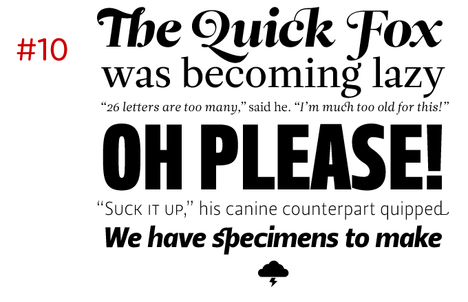
Leitura Serif, Sans, Headline, Display, News & SymbolsA multi-style type system for text, and display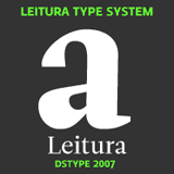
Two years ago, Dino dos Santos’s Esta was chosen as one of the year’s best text fonts. This time, he’s done even better. Leitura is a versatile and flexible type system for use in magazines, corporate identities, books and advertising. An admirable project that deservedly made it into our top 10 as the year’s top type system. 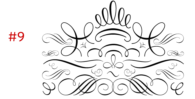
Ornament Accolades AA stylish package of calligraphic ornaments
The most popular ornament font of the year was designed by German designer Andreas Seidel and perfectly matches his own fine script fonts. However, Ornament Accolades A can be used with any other calligraphic or classicist font to give your designs for cards, calendars or brochures an aura of elegance and luxury. It is a rich set that’s been impeccably drawn and systematically structured, making them easy to select and combine. 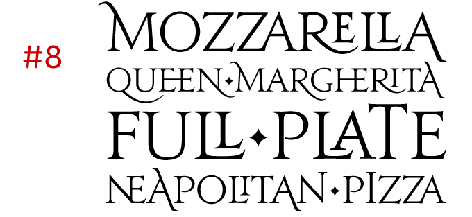
JupiterA perfectly organized battalion of ancient Romans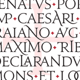
Jupiter from Canada Type has won the crown for top inscriptional roman of 2007. Inspired by the monumental capitals of ancient Rome, Jupiter recreates the alphabet of Roman antiquity in a way that no other printing typeface ever has. Designer Patrick Griffin provided the font with an unprecedented number of variations and ligatures. Jupiter Pro, the OpenType version, uses programmed features and stylistic sets to combine all these alternates to splendid effect. 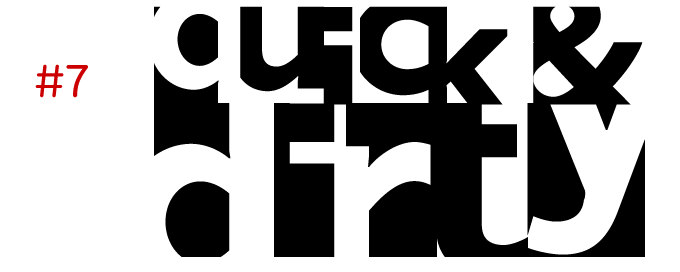
One Night StandA smart game of contrasting squares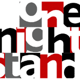
It’s a great paradox: the year’s top display font, One Night Stand, is actually a sans-serif text font. Designer Torbjörn Olsson cleverly cropped each character to its essence, zooming in on significant details. The result is a set of twin alphabets of rectangular boxes – black-on-white when typing the lower case alphabet, negative when using upper case. The font’s system makes it easy to create eye-catching headlines and poster layouts – even logos. Hundreds of customers have discovered the font’s attractive features, so this One Night Stand has turned into a fruitful long-term relationship. 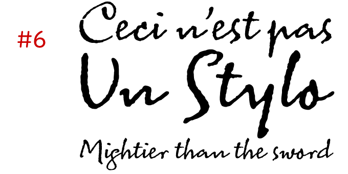
Sacre BleuA spontaneous, well-made handwriting font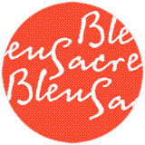
The year’s top handwriting font was inspired by a genuine sample of handwriting from 1930s France. Designer Mark van Bronkhorst turned it into a font with lively, rough outlines that retain the spontaneity of the original. Sacre Bleu looks deceptively simple, but its supple dynamics betray the hand of an expert. In fact, Van Bronkhorst has designed countless alphabets, pieces of lettering and logos for Disney and other prestigious clients. Sometimes it takes years of experience to create something that looks convincingly nonchalant. 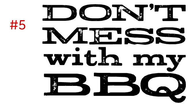
StudA grungy study of historical wood type
When it comes to creating “destructive” fonts, taking an existing typeface and giving it a good rub with some filters is not a very interesting method any more (and barely legal). Type designers with guts will choose a design of their own to be the victim. An historical alphabet from the letterpress era is the second best option. That is what Stud does; and it was the best-selling font of its kind, which we will hereby dub “distressed letterpress”. Designer Ray Larabie has made creative use of OpenType features to simulate the irregularity of hand-printed type, creating specially designed letter pairs that help break up the monotony of repeating letters. 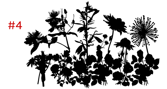
Subikto TwoA charming collection of flower forms
Subtitude’s Subikto Two earned its spot for the most popular picture font, beating the competition by miles. It undoubtedly owes its success to the stylishness of its intriguing silhouette shapes, allowing the user to use multicolored layers to create truly contemporary backgrounds and illustrations. 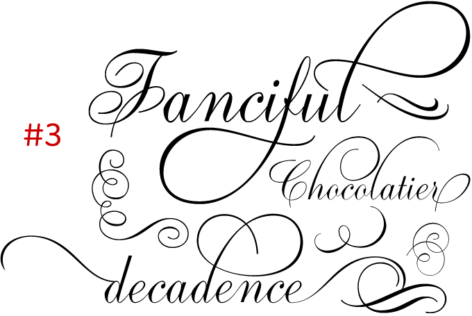
Ambassador ScriptSophisticated digitization of a roundhand script
Canada Type wins the award for top formal script with its exemplary revival of Aldo Novarese’s Juliet. Novarese’s “tipo inglese”, a reworking of an English roundhand, became the point of departure for a remarkable labor of love, on which designers Rebecca Alaccari and Patrick Griffin spent an estimated (and mind-boggling) one thousand hours. Equipped with a huge number of alternates, swashes, flourishes, beginning and ending forms, as well as snap-on strokes, Ambassador Script truly is the ultimate formal script. 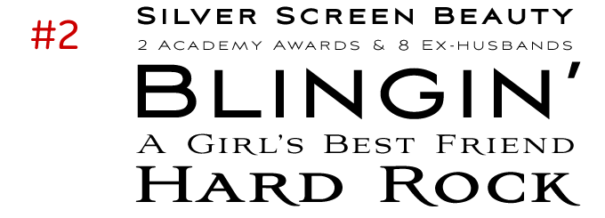
Aviano & Aviano SansA genteel couple for headlines and packaging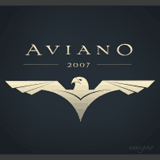
Jeremy Dooley’s insigne foundry was highly successful throughout 2007; Aviano was his absolute best-seller, followed closely by the font’s sans-serif companion, Aviano Sans. So they’re 2007’s “top display couple”. Like Jupiter, Aviano was inspired by the stone-carved capitals of the Roman Empire; however, it is a more personal, simplified interpretation. Being distinctly wider and less stern than its ancestors, Aviano emanates style and luxury. Both Aviano and Aviano Sans are dignified all-caps display faces for invitations, brochures and packaging. 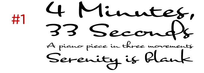
NothingA spontaneous script for a wide range of uses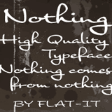
The year’s most popular informal script is also the #1 font of 2007. Why did designer Ryoichi Tsunekawa call it Nothing? Japanese modesty or Japanese humor? Either way, Nothing sort of falls in between categories: it’s spontaneous yet balanced, confident yet unassuming, elegantly connected yet technically simple. It might be inspired by hand-rendered lettering work from artists working for Hollywood or Madison Avenue. Its wide, connected shapes lend it an unmistakable authority and make it a fine font to create quality designs with a subtle hint of spontaneity. That’s all for 2007, folks. We are looking forward to presenting great new fonts every month, and will keep you posted on the latest developments. Stay tuned for some interesting surprises!
|